Overview
Formats
This module doesn't define any new formats.
Filters
This module doesn't define any new filters.
Widgets
color_picker
This module provides a color_picker field to allow users to choose from a predetermined list of colors. To use this field in the uiSchema set the ui:widget of an enum to color_picker and define the colorProps for each value.
Fields
This module doesn't define any new fields.
uiSchema
colorProps
For more complex field configuration the colorProps key contains an objet keyed by the values set in the field schema. Each value can have the following properties
hex
Any valid hex color code, this will be used as the background color for the preview box.
"ui:colorProps":{
  "black":{
    "hex":"#000"
  }
}
style
Any valid css style string. The css string will be applied directly to the preview box. Due to translation issues with
react when using background-* properties it is required to use the specific background property and not the
generic background.
"ui:colorProps":{
  "gradient-red":{
    "style":"background-image: linear-gradient(to right, red , yellow);"
  },
}
groups
Colors can be grouped together when displayed by specifying an array of groups for each color.
"ui:colorProps":{
  "black":{
    "hex":"#000",
    "groups":["Background"]
  }
}
displayGroups
If your uiSchema has groups defined but you don't want to show them then you can set ui:displayGroups to false
which will render all configured colors in one grid.
"example":{
  "ui:widget":"color_picker",
  "ui:displayGroups":false,
  "ui:colorProps":{...}
}
Examples
Hex only colors
The simplest usage of this field requires that you only provide a list of hex numbers in an enum. The hex code will be used as both the saved value and as the display color.
{
  "schema":{
    "properties":{
      "example":{
        "title":"Hex only example",
        "type":"string",
        "enum":[
          "#000",
          "#FFF",
          "#555"
        ],
        "enumNames":[
          "Black",
          "White",
          "Gray"
        ]
      }
    }
  },
  "uiSchema":{
    "color":{
      "ui:widget":"color_picker"
    }
  }
}
Grouped colors
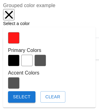
{
  "schema":{
    "properties":{
      "example":{
        "title":"Grouped color example",
        "type":"string",
        "enum":[
          "#000",
          "#FFF",
          "#555",
          "#FF1919"
        ],
        "enumNames":[
          "Black",
          "White",
          "Gray",
          "Red"
        ]
      }
    }
  },
  "uiSchema":{
    "example":{
      "ui:widget":"color_picker",
      "ui:colorProps":{
        "#000":{
          "group":[
            "Primary Colors"
          ]
        },
        "#FFF":{
          "group":[
            "Primary Colors"
          ]
        },
        "#555":{
          "group":[
            "Accent Colors",
            "Primary Colors"
          ]
        }
      }
    }
  }
}
Don't show groups
{
  "schema":{
    "properties":{
      "example":{
        "title":"Grouped color example",
        "type":"string",
        "enum":[
          "#000",
          "#FFF",
          "#555",
          "#FF1919"
        ],
        "enumNames":[
          "Black",
          "White",
          "Gray",
          "Red"
        ]
      }
    }
  },
  "uiSchema":{
    "example":{
      "ui:widget":"color_picker",
      "ui:displayGroups":false,
      "ui:colorProps":{
        "#000":{
          "group":[
            "Primary Colors"
          ]
        },
        "#FFF":{
          "group":[
            "Primary Colors"
          ]
        },
        "#555":{
          "group":[
            "Accent Colors",
            "Primary Colors"
          ]
        }
      }
    }
  }
}
String value colors
The enum values for a color don't have to be hex, they can be any valid enum value. When using a non hex value a hex
or style value must be provided in the ui:colorProps of the field.
{
  "schema":{
    "properties":{
      "example":{
        "title":"String values example",
        "type":"string",
        "enum":[
          "black",
          "white",
          "gray",
          "red"
        ],
        "enumNames":[
          "Black",
          "White",
          "Gray",
          "Red"
        ]
      }
    }
  },
  "uiSchema":{
    "example":{
      "ui:widget":"color_picker",
      "ui:colorProps":{
        "black":{
          "hex":"#000"
        },
        "white":{
          "hex":"#FFF"
        },
        "gray":{
          "hex":"#555"
        },
        "red":{
          "hex":"#FF1919"
        }
      }
    }
  }
}
Color styles
{
  "schema":{
    "properties":{
      "example":{
        "title":"Color styles example",
        "type":"string",
        "enum":[
          "gradient-red",
          "transparent-green"
        ],
        "enumNames":[
          "Gradient red",
          "Transparent green"
        ]
      }
    }
  },
  "uiSchema":{
    "example":{
      "ui:widget":"color_picker",
      "ui:colorProps":{
        "gradient-red":{
          "style":"background-image: linear-gradient(to right, red , yellow);"
        },
        "transparent-green":{
          "style":"background-color: rgba(0, 128, 0, 0.3);"
        }
      }
    }
  }
}
Optional field
To make a field optional the property type needs to be either type: ["string", "null"] or unset completely because
RJSF will store an empty field as a null value. Additionally null must be added to the enum array as a possible
value. Typically this is best to add at the end of the array, if you add it anywhere else make sure to also give it a
corresponding enumNames label.
{
  "schema":{
    "properties":{
      "example":{
        "title":"Hex only example",
        "type":["string", "null"],
        "enum":[
          "#000",
          "#FFF",
          "#555",
          null
        ],
        "enumNames":[
          "Black",
          "White",
          "Gray"
        ]
      }
    }
  },
  "uiSchema":{
    "color":{
      "ui:widget":"color_picker"
    }
  }
}
Required field
Setting a property using the color picker to required will remove the "Clear" button and disable unselecting the current color by clicking on it.
{
  "schema":{
    "required": ["example"],
    "properties":{
      "example":{
        "title":"Hex only example",
        "type":"string",
        "enum":[
          "#000",
          "#FFF",
          "#555"
        ],
        "enumNames":[
          "Black",
          "White",
          "Gray"
        ]
      }
    }
  },
  "uiSchema":{
    "color":{
      "ui:widget":"color_picker"
    }
  }
}
Everything
{
  "schema":{
    "properties":{
      "example":{
        "title":"Everything example",
        "type":"string",
        "enum":[
          "#000",
          "white",
          "no-group-gray",
          "gradient-red",
          "transparent-green"
        ],
        "enumNames":[
          "Black",
          "White",
          "No group gray",
          "Gradient red",
          "Transparent green"
        ]
      }
    }
  },
  "uiSchema":{
    "example":{
      "ui:widget":"color_picker",
      "ui:colorProps":{
        "#000":{
          "group":[
            "Hex Colors"
          ]
        },
        "white":{
          "hex":"#FFF",
          "group":[
            "Hex Colors"
          ]
        },
        "no-group-gray":{
          "hex":"#555"
        },
        "gradient-red":{
          "group":[
            "Style Colors"
          ],
          "style":"background-image: linear-gradient(to right, red , yellow);"
        },
        "transparent-green":{
          "group":[
            "Style Colors"
          ],
          "style":"background-color: rgba(0, 128, 0, 0.3);"
        }
      }
    }
  }
}